Tuesday, 11 December 2012

Filming plan 2


Brief about what happens in the shots:
The shots to create a jump in the Anderson shelter. The POV shots are of the character walking down the steps into the shelter, then standing in the room. They see the note on the far wall, and suddenly turn around. They see Slender standing in the corner, and the shot gets wider and longer to show that they are jumping backwards.               

Shots:
- High angle shot of steps into shelter
- Tracking shot of walking down the steps
- POV wide shot of room
- Eye line match / extreme close up of Slender
- Fast zoom out to a wide eye line shot of Slender


Date:

Saturday 8th December 2012

Time:
6pm

Location:
Anderson shelter in Mr Taylor's garden

Equipment:

Lighting = Torch X 2 (1 Yellow light torch, 1 white light torch)  
Filming = 
iPhone 4s, black DSLR camera, tall adjustable tripod, Steadicam 
Power = 
Phone battery, batteries in torches, rechargeable battery in camera
Other =

Actors:
- Nick Wilson (playing Slender) – black suit, white shirt, face paint (white face and black eyes)

Props:

Risk assessment:
The steps into the shelter will probably be slippery as the temperature now is so low that surfaces are beginning to ice over. I therefore will have another person on the side of the shelter (on the grass) to catch anyone if they slip/fall. Surfaces may also be unclear in the dark, so I will check the floor surfaces/loose steps etc. in the daytime prior to the film shoot.

Contingency plan:

- Spare batteries for torches
- Extension lead and lamp ready if I need to use them, as the torches may not be enough light to light the room

Letter of land permission : Anderson shelter

As part of my planning & storyboarding, I wrote a letter to the owner of the land that I wish to use. The Anderson shelter will be perfect for my horror trailer. I therefore wrote to the land owner to ask for permission to photograph and film there. 

I have attached a print screen picture below of the letter. (click to enlarge)


A few days later, I received an email from Mr Taylor. I have added a picture below of his reply. (click to enlarge)

Thursday, 6 December 2012

Filming plan 1


Brief about what happens in the shots:
The end shots of the trailer. Slender is standing at the end of the abandoned room and 2 of the characters are shining a torch on him. The characters then look down at their video camera and when they look back up, Slender is closer. The torch then fades and when it comes back on, Slender jumps in front of the camera.

Shots:
- POV / eye line long shot of room and Slender
- POV / high angle close-up of video camera
- Eye line Long / medium shot of Slender in room
- Close up with shallow focus of Slender jumping in front of camera

Date:
Tuesday 27th November 2012

Time:
4.45pm (dark outside)

Location:
Abandoned mushroom farm rooms/sheds

Equipment:
Lighting = Torch X 2 (1 Yellow light torch, 1 white light torch) 
Filming =
iPhone 4s, tall adjustable tripod
Power =
Phone battery, batteries in torches
Other =

Actors & costumes:
- Nick Wilson (playing Slender) – black suit, white shirt, face paint (white face and black eyes)

Props:
-Video camera that characters hold / film slender on (separate to my filming equipment)

Risk assessment:
Will be filming in an abandoned place, so rubble and other rotten materials are trip hazards. I will have to also ensure that in the room I film in, there is no risk of anything falling down whilst filming.
It is also very cold, so I will make sure that my actor has a thick coat/suitable clothing to wear in-between shots/to and from the location.


Contingency plan:
- Spare batteries for torches
- If I can’t film some shots, I can film them on another film shoot at a later date (as I will need to film more at the same location)

Tuesday, 4 December 2012

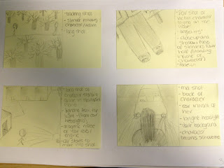
Storyboarding

A storyboard is a sequence of drawings, typically with some directions and dialogue, representing the shots planned for a video. I created my storyboard after I came up with my film synopsis, and have only just been able to post it due to availability of the scanner (which in the end didn't work so I took pictures of the storyboards instead).

I created it on Post-It notes, and found this very useful. This is because I was able to move all of the shots around once I have created them, and could draw/jot down ideas of shots if I suddenly thought of them. I found this beneficial as I was therefore able to create my storyboard not in order, so I could add to it when an idea popped into my head.


Film synopsis

I created a film synopsis before I storyboarded, so I knew what to storyboard. I have chosen not to upload it unitl now because I want my storyboard to be uploaded at the same time, as both documents/tasks go together and I havn't been able to upload my storyboard until now.


My trailer will be for the film called Slender. I have loosely based the film on the Slender Man myth. It is also loosely based on the children’s playground game Grandma’s Footsteps, where people move closer until the individual turns around and the people moving closer freeze/stand still (this being Slender moving towards the people).

The beginning of the film is a group of teenagers who discover the Slender Man myth online. Slender then starts to follow them, and someone in the group see’s him/catches his attention, and it’s now too late. Slender is an observer from the darkness, and is a mockery of human form, who is a harbinger of paranoia and violent death. The more they look at him, the closer he’ll get when they aren’t looking, and he doesn’t move whilst they are looking at him/shining light on him.

The storyline shows how the victims can only kill/rid of Slender if they find the 8 ancient notes to earn their freedom. The tense adventure follows 3 friends who all in turn see Slender, and have to find the notes without him getting too close. One by one they face Slender as he gets nearer, but will they escape?

Tuesday, 27 November 2012

Film plan template

I created this last week, and it is a template of a film plan. I will use this to help plan my filming, so that I plan every aspect of things that I will need and risks. The plan also includes a brief about what happens in the shots i'm filming, and a contingincey plan if things go wrong.

This is useful because I will have planned that things that potentially could go wrong, and will have things to fall back on, such as a spare camera battery. For each plan they will have all of the sub headings, and some may have extra depending on the compelxity of the film shoot.

Diary update: week 11

Over the past few weeks I have completed my storyboarding, and am now making film plans about all the details about my shoots. I also have started photography of all locations and mise-en-scene/props etc. and have started filming the end few shots of my trailer. I have chosen to not film the shots in the order that is in my storyboards as I will edit the shots in differant orders anyway, and it has also been influenced by the availability of actors and equipment etc.

According to my timeline I am meant to be editing/finishing filming. However, I have had some problems with filming as it has been hard to organise my actors on the same day, as they are also doing other filming too. Although, I have checked my calendar/schedule and have found that I have plenty of time in the Christmas holidays to compelte my editing, as I will have more free time than I have lesson time in school weeks. 

This week I am filming, and am making film plans for other filming that I need to do. Throughout this I will also be photographing everything I do, so that I can evaluate and post on here what I have done, how i've done it and how sucessful it was. I also will be posting my storyboard and feedback up this week, although I won't be able to upload until later this week due to availability of the scanner.  

Sunday, 11 November 2012

Potential location

After sending the letter for land permission, I received a phone call from the owner, Mr Bird, to confirm that I can use the land. I therefore went to the location to take pictures and to build ideas about what to film there, and where to film it.

I have attached some pictures of the location below, and this has helped spark ideas about what to include in my trailer. For example, I will probably carry out the car hitting the victim stunt here, and the shots of Slender jumping out at characters here in the abandoned rooms.


On the bottom 2 pictures, I edited them to see what effects I could achieve, and I think it went well because the colours/shadows/contrasts etc. represent the theme of horror well. I edited and posted them on Instagram, and iPhone app that lets you share photos with your followers, and users can search hash-tags which other people have tagged in captions of their photos. For both pictures, a few of my followers 'liked' them, so I feel that the editing worked well. 


Thursday, 8 November 2012

Letter for land permission

As part of my planning & storyboarding, I wrote a letter to the owner of the land that I wish to use. The land is abandoned and run down, which is perfect for my horror trailer. I therefore wrote to the land owner to ask for permission to photograph and film there.

I have attacthed a print screen picture below of the letter. (click to enlarge)


Sunday, 4 November 2012

Diary update: week 8

It has come to the end of week 8, and by now I should have started filming. However, I am still awaiting many survey responses, so I am finding it difficult to move forward with the project, as my planning & story boarding will largely be based around my survey responses.

Although, I have started to plan my trailer, and have created an initial ideas thought-web, and have also collected some photographs of some potential filming locations. I have also purchased some fake blood as it is currently Halloween and I thought that now is the best time to purchase it, as I am very likely to use it in my horror trailer. So although I have not yet completed my Research of target audience section, I have made some progress in my Planning and story boarding section.

I now aim to complete my survey collection of responses and analysis of them by the end of week 9 (this next week), and to also finish Planning and story boarding. Although this will cut into my planned time for filming, I have timetabled myself 7 weeks in total to complete filming and editing. This therefore should be more than enough time to complete this is one/two weeks less, especially as I will be filming in my spare time (creating more time at school to complete other tasks).

Initial ideas thought-web

I have already decided that my trailer will be for a horror film. I created this thought-web over the course of a few days, and added to it when ideas popped into my mind. These are not my final ideas, however I am likely to use quite a few in my real teaser trailer. 

Twitter account

I just made a Twitter account for this project. This enables me to 'follow' my target audience so that i can Tweet them links/ideas/pictures etc. to get feedback. It also enables me to be 'followed' people, so that they can see my Tweets and what I post, so again I can get feedback on my work. Ultimately this can lead to my work being more suited and more tasteful to my target audience, so that the trailer, poster and magazine cover can be the most effective at portraying the horror genre.

However, I will not be able to access Twitter.com in school, so I will have to make sure that I remember to post my ideas/work on Twitter when I get home.

Here is a print screen and a link of my Twitter account:


Monday, 29 October 2012

Questionnaire sampling & data gathering

To create my actual questionnaire i used www.surveymonkey.com. This is a website that allows you to create online questionnaires and then link people your survey, or post it to the www.surveymonkey.com home page so that random people can answer your questions. This is what it will look like when people click the link to answer my questionnaire:


Link to full questionnaire: http://www.surveymonkey.com/s/HP8RKGV


Email:

Instead of posting my questionnaire to the Survey Monkey home page (other Survey Monkey users), i decided to email individuals my questionnaire. I chose to do this because I could control who answers my questionnaire and I thought that it would be a quicker way of receiving responses. I posted the link to my questionnaire in the email, as shown below.


Sampling:
I chose to send my email to 30 people, so that I have a large enough sample to make more accurate conclusions from. I sent the email to ten 15 - 25 year olds, ten 26 - 35 year olds, and ten 36+ year olds. I chose this sample method because it is more controlled and the results will be more reliable as there will be a wider range of ages. This is because if i used random sampling by posting the questionnaire to Survey Monkey, the majority of the responses are likely to be just the people who use Survey Monkey, which could only represent a small age range. 

Horror teaser trailer questionnaire

As part of my Research of target audience section, I decided to create a questionnaire. I did this so that i could gather information about my target audience, and about what they prefer/thinks works well in horror teaser trailers. It also asks them their personal opinions about preferred themes etc. Gathering this information will enable me to create a teaser trailer that is more suited to my target audience, so the trailer is a stronger advertisement for the film. I asked a range of open and closed questions, so that i could gather qualitative and quantitative data. This can then be analysed and my trailer can be based around the data gathered.

These are the questions and some answer options in my questionnaire:


1. How old are you?
15 - 25            26 - 35            36+


2. What do you think makes a good teaser?


3. How long do you think it should be?
0-30 secs                31-60 secs              61-90 secs             91-120 secs


4. Do you think that longer or shorter clips from the film work better in a horror trailer?
- Longer
- Shorter


5. Do teasers largely influence your decision to watch a film?
- Yes              - No


6. Why do they/don’t they influence your decision?


7. What do you enjoy most about horror films?


8. When is the best time of year to release a horror film?


9. What type of horror films do you like?
- Body horror
- Action horror
- Comedy horror
- Psychological
- Zombie
- Slasher


10. What are the top 3 elements of a horror teaser?
-  Storylines / twists
-  Realism
-  Abnormality
-  The actors
-  The suspense/jumps
-  True stories

Format research evaluation

Woops, forgot to post this a few weeks ago!


Because I have chosen to create a teaser trailer for a horror film, i analysed 3 horror film trailers. This analysis helped me to gain a better understanding of the conventions and themes used in horror trailers. This therefore is now helping me to create ideas about what my trailer should include, and what is typically found in horror trailers.

Actors - In 2 out of the 3 trailers, the main characters were shown. This is important as it introduces key people in the film, which may also be very effective if the actors are very famous (and therefore give the trailer/film a lot of selling power). It also gives an idea of what the film is about, the storyline theme, and who the film is aimed at. The costume and physical characteristics of the characters is also important, as in most of the trailers, it gave a sense of realism, which is a key convention of many horror films today.

Sound - Non-diagetic music was used in all trailers, and I have found that it is key to creating an atmosphere and building/developing the horror theme in the on screen footage. Sounds that are harsh toned and slow paced are also effective as they build tension and give a sense of negativity. The use of simple non-diagetic music (such as just one or two instruments playing) was effective also as it created eeriness and means that the focus is still on the on screen footage. Diagetic sounds such as loud screams conform to the horror genre as screaming suggests pain and negative imagery, and I will certainly be using this in my trailer!


Locations - In 2 trailers, various locations are shown. This is a key convention of any trailer I think, as it introduces the settings and nature of the film. It also gives a sense about the characters lives and certain locations (such as the houses used in 2 of the trailers) gives a sense of the storyline of the film/the realism of the film. However, The Shining trailer challenged this convention, as only one location was used, and was effective as it left the audience wondering what will happen in the film.


Narration - 2 of the trailers used narration over the top of the footage on screen. This was used to engage the audience and to get them thinking more about the film by involving them. The narrations used asked the audience questions and gave them information about the storyline, which is effective at attracting the audience's attention and increasing their desire to watch the film as it gives them a broader idea of what the film is about. I found that the narration is usually a man, and his voice is usually deep so that eeriness and tension is built, and so a sinister effect is created.


Camera work - The angle of the shots seems to be very important, as it helps the audience understand and feel what/who has power and who is vulnerable in the film. POV shots were also common, which is a big convention of horror films as it lets the audience feel like they are in the characters shoes. This creates fear and tension amongst the audience, which is key in the horror genre. Close-ups/extreme close-ups are used to introduce themes (such as death through the shots of weapons etc.) and storyline hints, giving the audience a better idea about what the film is about.


Editing - In the trailers (apart from The Shining), many clips from the film are used. This is effective at giving the audience an idea of what the film is about, what the theme of the film is, how well it is made, and introduces characters/locations etc. The titles of the films are also not shown until the end. I found this effective as it meant that I had to watch the whole trailer before I could see what the film was actually called and when it was being released.


 Credits/logos - At the end of the trailers there are usually credits, which makes the audience feel like they have just watched part of the film. The audience may therefore watch the film if they like what they saw. The production company's name/logo is also normally shown at the beginning of the trailer, so that the audience can recognise and memorise who the company are before they view the trailer. It also may therefore give the audience preconceived ideas of how good the film will be if they recognise that the company has produced other films that they liked/were successful.


Ratings / release date - This is usually the last thing to be shown in the film, as again, the audience have to watch the whole trailer before finding out vital information about the film. It is also important that the age rating is included, because viewers may be disappointed if they go to the cinema to then be turned down because they are too young. Ratings from critics are sometimes used, which can largely influence the audiences decision on whether the film looks good enough to watch.


Tuesday, 16 October 2012

New tripod!

Yesterday (15th October) my new phone holder with tripod arrived. It is quite small so I will use the top of the tripod (that holds the phone) on a larger tripod when I film anything that is not close up probably.

Its cute and small, meaning that it can get close to the floor/surfaces and many angled shots can be achieved. I took some pictures of the tripod and holder, and also took a picture to show one of the angled shots I took. 


Diary update

I am currently in week 6 of the project, so I should be doing planning & storyboarding according to my timeline. However, it has taken me longer to do format research and research of target audience due to restricted website access at school and because I am still awaiting some survey replies.

I therefore am still carrying out research of target audience, so will start planning & storyboarding next week hopefully. This does not largely affect my timeline though because I timetabled week 6 & 7 for planning & storyboarding. I therefore will aim to complete all planning & storyboarding in week 7 and maybe some in week 8 when filming is due to start. This will probably change anyway due to the dates I can start filming. 

Format research update : magazines & posters

Due to the restricted access of websites at school, I have found it difficult to complete all format research I had planned to do in weeks 2, 3 and 4. I managed to complete 2 magazines analysis (out of 3) and 1 poster analysis (out of 3), so later on I will complete the last magazine analysis and 2 more poster analysis for the ancillary tasks. Although technically I am behind on my timeline due to this, I think it will benefit me as it means I can focus on planning & storyboarding and filming now, which is the main task. I will find a bit of time later on to complete this format research, but for now here is some pictures of what I have completed: ( I will post the actual analysis later on when I complete the rest of the analysis pieces)


This is my first analysis of a film magazine


This is my second analysis of a film magazine


This is my first analysis of a poster

Thursday, 11 October 2012

Trailer analysis - Friday the 13th (1980)


Mise-en-scene

  • Establishing shot shows the setting to be night time – darkness and the contrasting bright moon is the use of pathetic fallacy to create an eerie and negative atmosphere. A sense of mystery is also created as the audience doesn’t know what is lurking in the dark
  • In the first killing, a torch is the only lighting, and is shining on the victim -creates contrast to the dark background and makes the character vulnerable. It also creates a focal point for the audience.
  • One setting used is a house – adds realism, the viewer can relate to the film, making it seem scarier as they could be in that situation
  • Another setting used is the woods – creates tension as the killers can hide in the woods and could jump out at any moment. This setting is commonly used in horror films as there is little human life there and no easy/quick escape routes for characters/victims
  • Many killing weapon props used – follows the conventions of slasher horror films, as they are commonly based around psychopathic killers. This will also ‘play’ on the audiences fears of being attacked and killed
  • The actors costumes are every day casual clothes – adds realism as the audience will be able to easily imagine if it was them

Camera shots/angles
  •  First shot is an establishing shot. It shows the dark sky with the moon in the top right of the shot, showing clouds moving fast – introduces the setting and time of when the film is set
  • Subjective POV shot (character in story experiencing events) of the first death in the killers perspective – the audience can experience exactly what the killer does and can see how the victim reacts. This also therefore doesn’t give away who/what the killer is so quick
  • Tracking shot of women running through the woods (towards the camera) – shows her trying to escape and also shows the setting well
  • Shallow focus close up of many of the killing weapons – theme of death is introduced, and creates fear amongst the audience as the focus is sharp and on a small area

Editing

  • Before each killing, a shot of big, bold, and red font is used to show the number of the killing – gives the trailer/film a storyline in sequence
  • Relatively long shots of each killing are used – typical of older horror slasher trailers
  • Many clips from the film are used – gives away alot of action/storyline but if the viewer likes the clips, then they will probably be persuaded to watch the film
  • Text from the top left ascends at the end of the trailer – gives the name of the film. Revealing the name at the end means that the viewer will have to watch the whole of the trailer to find out what the film is – a good marketing technique

Sound
  • Narration over the trailer from a man with a deep and scary voice – says the numbers 1 to 13 whilst clips of each killing is happening on screen
  • Loud diagetic scream – played over the shot of one of the main characters being killed. This adds realism to the shot and readies the viewer for what is about to happen. This also implies terror and pain, which is very typical of horror films
  • Diagetic sounds of natural noises such as wind – adds realism. This is also slightly the use of pathetic fallacy to create a negative atmosphere
  • Non-diagetic harsh toned string instruments playing – use of incidental music to accompany action – creates a sense of eeriness and creates tension, especially when the pace of the music increases leading up to the death of the characters 

Genre / how specific audiences are targeted

  • Slasher films usually contain a number of killings by a psychopathic killer. The trailer tells the audience that this film involves this, therefore conforming to the horror slasher genre
  • Does not follow the conventions of a normal trailer. However, it is common that slasher trailers give away alot about the storyline because this genre of horror focuses more on each killing rather than the storyline
  • Conforms with Lisa Kernan’s quote, “…a unique form of narrative film exhibition, wherein promotion discourse and narrative pleasures are conjoined” – the trailer is a mini narrative of the film. The meaning of the film/main issue is introduced through many clips from the film
  • Also follows the conventions of horror trailers from the 1950’s, when many key scenes/events were previewed and the storyline was given away


Trailer analysis : Fright Night (1985)


Mise-en-scene
  • Night time – typical of horror films as it is dark and there is little life about, and the darkness creates tension as the viewer can’t see alot so they don’t know what will pop up (mysterious feeling is set)
  • Set at a house – adds realism, the viewer can relate to the film, making it seem scarier as they could be in that situation
  • Prop - A metal crucifix cross is held up by one of the main characters – suggests that the film is based around something sinister or unholy
  • Another prop used is a gun. An older main character fires the gun, which conforms to the generic horror convention of weapons and death

Camera shots/angles
  • Zooming in shot of the open window – anticipation, builds tension as the viewer waits to see what is in there. Also could be a POV shot of the villain/werewolf walking towards the window
  • Two shot of main character (Charlie) and his mum, then another two shot of him and his girlfriend – introduces main characters
  • Many clips from film – gives viewers a taste of the film/brief idea of what happens
  • Low angle shot of the werewolf – makes the viewer feel vulnerable and introduces the main situation/what the film is based on

Editing
  • Title of film at the end of the trailer – makes viewer watch the whole trailer to find out what the film is
  • Title is in red jagged font – connotations of blood, evil, sharp edges gives connotations of destruction and pain /weapons
  • Quick cuts between many clips mid way through the trailer – shows what the story line is, implies the film is fast paced (alot of action, which doesn’t conform to normal horror movies)
  • Long zooming in shot of window at beginning – lack of cuts builds tension, makes viewer focus

Sound
  • Narration over the trailer from a man with a deep and scary voice – asks rhetorical questions to viewers which gets them thinking, also gives an idea about what happens in the film
  • Loud diagetic scream – played over the shot of the main character suddenly turning around to see where it came from. This shocks the viewer and makes the viewer want to continue watching to find out what it was. This implies there is terror/pain
  • Non-diagetic noises of the wind – fits in with setting (storm at night), creates eeriness. This is the use of pathetic fallacy to create a specific mood/atmosphere

Genre / how specific audiences are targeted
  • Conforms with Lisa Kernan’s quote, “…a unique form of narrative film exhibition, wherein promotion discourse and narrative pleasures are conjoined” – the trailer is a mini narrative of the film. The meaning of the film/main issue is introduced through many clips from the film
  • Conforms with the normal conventions of a horror trailer, as the story line is shown and characters are introduced


Film trailers - Analysing narrative theory


NARRATIVE = the coherance/organisation given to a series of facts.
The human mind needs narrative to make sense of things. We connect events and make interpretations based on those connections. In everything we seek a beginning, middle and end.


Propp’s theory of Narrative:

  • Suggested that characters took on the role of narrative ‘spheres of action’ or functions. From a comprehensive study of folktales Propp came up with seven different character types
  • Some characters fit more than one role
  • Have these roles changed/adapted for modern audiences?

     Hero:
- Usually male, is the agent who restores the narrative equilibrium (everything’s ok) often by embarking upon a quest (or search)
- Propp distinguishes between the victim hero, who is the centre of the villains attentions, and the seeker hero who aids others who are the villains victims
- The hero is invariably the texts central character

            Villain:
- Usually creates the narrative disruption

Donor:
- Gives the hero something, it may be an object, information or advice which helps in resolution of the narrative

Helper:
- Aids the hero in the task of restoring equilibrium

Princess:
- (the victim) usually most threatened, has to be saved by the hero at the climax
- The father’s role is usually  to give the princess away to the hero at the narrative’s conclusion

Dispatcher:
- Sends the hero on his/her task (who can typically be the princesses father)

False hero:
- Appears to be good, but at the end he/she is revealed to be bad


Todorov’s Narrative Theory: Equilibrium & disequilibrium

·        He argues that narrative involves a transformation
·        The characters or the situations are transformed through the progress of the disruption

5 Stages:
1.       A state of equilibrium (All as it should be)
2.      A disruption of that order (by an event)
3.      A recognition that the disorder has occurred
4.      An attempt to repair the damage of the disruption
5.      A return or restoration of a NEW equilibrium


Trailer analysis : The Shining (1980)


Although my timeline says that I should be completing 3 format research tasks of trailer in week 2, I completed this piece of analysis over the summer so that I could save time when this full project started in September. 

Mise-en-scene
  • Dull, bleak colours (brown, grey, white etc) – shows no sense of possessiveness, and makes the set look more creepy from the dark grimy colours
  • The red blood coming through the elevator doors contrasts to the white and dark colours – connotations of death, shows horror genre
  • Set in a hotel lobby – realism makes it more scary as it is a public place which most views would’ve visited at some point

Camera shots/angles
  • One long shot of the elevator and corridor – builds tension and creates eeriness to go with the genre of the film
  • Low angle shot, looks directly at the doors – makes the audience feel vulnerable
  • Static shot – builds tension, the viewer knows something will happen

Editing
  • Simple white font credits ascending at the beginning of the trailer – looks like end credits – attracts viewers attention to the visuals
  • Scrolling motion of the credits creates tension and keeps the viewer watching
  • No cuts or transitions in the trailer – simplicity, builds tension, minimalistic feel, makes the viewer focus

Sound
  • Non-diagetic slightly harsh toned music crescendos to build tension – builds up to something?
  • The simplicity of the music (just the piano playing) creates eeriness and makes the viewer focus on the visuals rather than the music (music isn’t distracting)

Genre / how specific audiences are targeted
  • Goes against Lisa Kernan’s quote, “…a unique form of narrative film exhibition, wherein promotion discourse and narrative pleasures are conjoined” – the trailer is simple, and is not a mini narrative of a normal film trailer. The meaning of the film and clips from the film are not shown and therefore aren’t distorted
  • Goes against the normal conventions of a horror trailer, as there is only one shot and no characters/storyline is shown